05/04/2020 -
In the particular situation that the Coronavirus pandemic brings us to live,
the dissemination of information is an even more complex subject than it usually is.
Newspapers, news broadcasts and digital channels provide daily updates on the world and national situation, but often
it is difficult to contextualize the data or conduct comparisons between different instants or different places.
In order to make possible an optimized observation of the available information - with time-evolving comparatives charts - together with Sergio I created a free web-app dedicated to scientific and rigorous information, with a simple and intuitive interface.
It's called PandemicData, and it's online at the following address:
PandemicData.info
The platform consists of two pages, one dedicated to world data and one reserved for information regarding Italy.
The national trend can be observed by plotting the data of the different regions on graphs, in which a certain information (such as the total number of deaths, infected, hospitalized) is displayed for the selected regions in the time period, which runs from the beginning of the pandemic to the current date. Other information calculated by the software - such as the average lethality per region o the percentage of people in intensive care out of the total number of hospitalized patients - are displayed on histograms.
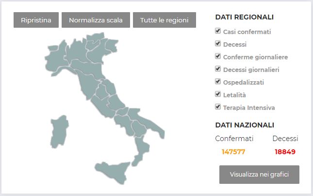
In order to make possible an easier interpretation of the data, all information can be displayed by scaling the quantities compared to the population of the specific italian region: in this way it is possible to see not only how many have died or those hospitalized in a certain region, but also what percentage of the population of this region they represent.
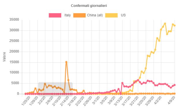
For the observation of global trends, the functionalities are very similar, even if in part limited due to the amount of data with which you operate. All the countries of the world - and for some even individual specific regions - are listed in a menu that allows you to choose which ones to display on the graphs. Again, the main purpose of the software is to make simple comparisons possible with intuitive illustrations.
The data is collected from official repositories that we believe to be reliable, updated respectively - for Italy and for the World - by National Civil Defense and Johns Hopkins. The purpose of the software, as already explained, is not to provide alternative data, but to be a simple tool to interpret official sources in an intuitive and versatile way. More complete information on the structure of the project and the data sources are shown on the following page:
PandemicData - Credits & Info
From a technical point of view, the software is built through PHP and JavaScript scripts that retrieve information in real time from repositories and make them available through graphics made with a dedicated library. To better manage the flow of data, some asynchronous requests are done via Ajax, and some copies of the most recent data are stored on the server.
In order to make possible an optimized observation of the available information - with time-evolving comparatives charts - together with Sergio I created a free web-app dedicated to scientific and rigorous information, with a simple and intuitive interface.
It's called PandemicData, and it's online at the following address:
The platform consists of two pages, one dedicated to world data and one reserved for information regarding Italy.
The national trend can be observed by plotting the data of the different regions on graphs, in which a certain information (such as the total number of deaths, infected, hospitalized) is displayed for the selected regions in the time period, which runs from the beginning of the pandemic to the current date. Other information calculated by the software - such as the average lethality per region o the percentage of people in intensive care out of the total number of hospitalized patients - are displayed on histograms.
In order to make possible an easier interpretation of the data, all information can be displayed by scaling the quantities compared to the population of the specific italian region: in this way it is possible to see not only how many have died or those hospitalized in a certain region, but also what percentage of the population of this region they represent.
For the observation of global trends, the functionalities are very similar, even if in part limited due to the amount of data with which you operate. All the countries of the world - and for some even individual specific regions - are listed in a menu that allows you to choose which ones to display on the graphs. Again, the main purpose of the software is to make simple comparisons possible with intuitive illustrations.
The data is collected from official repositories that we believe to be reliable, updated respectively - for Italy and for the World - by National Civil Defense and Johns Hopkins. The purpose of the software, as already explained, is not to provide alternative data, but to be a simple tool to interpret official sources in an intuitive and versatile way. More complete information on the structure of the project and the data sources are shown on the following page:
From a technical point of view, the software is built through PHP and JavaScript scripts that retrieve information in real time from repositories and make them available through graphics made with a dedicated library. To better manage the flow of data, some asynchronous requests are done via Ajax, and some copies of the most recent data are stored on the server.